Two Skeuomorphs: A Radio and a Weight Tracker
The 2007 Transformers movie showcased three stars: Megan Fox, Shia LaBeouf, and an all-new, futuristic-but-retro Chevrolet Camaro. All men drooled over Megan Fox, but the car guys moved on to slobbering over the Camaro. Built to hearken the muscle cars from yesteryear, the Camaro combines old-school styling with today’s technological advancements. The dash, for example, incorporates oversized analog dials and digital readouts. The body shape is pure muscle, yet the windows automatically open slightly when the doors open and roll back up when the doors close to reduce cabin pressure. And it’s rollicking fun to drive.
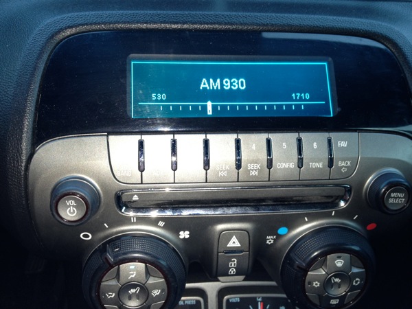
I recently bought a 2010 Camaro SS with leather seats, premium sound system, and a V8 engine that mainlines gasoline. While I normally listen to podcasts and music from my iPhone (plugged in to the car’s USB port), I occasionally listen to the radio. The first time I used the radio’s tuning knob to change the station, I expected the radio display to remain static save for the frequency, which would increase or decrease as I spun the knob. Instead, the display changed to a skeuomorph, mimicking an old car radio band view, with the frequency spectrum displayed along a horizontal axis and a pointer indicating the current frequency, like this:

My first reaction was, “Aw, cool!” but the excitement quickly waned. This skeuomorph tells you two things:
- The breadth of the spectrum
- The relative position of the current frequency to that spectrum
Neither datum is particularly useful — who cares how close I am to the end of the spectrum? — and I can no longer see the time while I’m tuning. The “tuning” view is gratuitous skeuomorphism that quickly becomes annoying. Good thing I’m a Jungle Insider and can just listen to Rome rants from my iPhone.
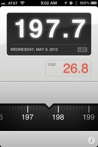
Switch gears. I’ve been tracking my weight on my iPhone with the Lose It! app, which is great for tracking calories consumed and expended, but not so much for weight (no graph, for example, that I could find). I tired of tracking my caloric consumption, and I log my runs in Daily Mile, so I really wanted an app optimized for tracking weight. Enter Weightbot, by the makers of Tweetbot. I bought it, weighed in, and went to enter my weight. I assumed I would type my weight using the onscreen number keyboard layout, but instead I saw another skeuomorph: a horizontally-rotating dial that mimicked an analog scale, like this:

This time, I didn’t think, “Aw, cool!” Instead, I thought, “This sucks!” Tapping out a number on the keyboard is quick and requires little precision, as the numbers on the keyboard are plenty big. Spinning the dial at the bottom of the screen takes longer and requires more precision. I felt disappointed.
After a couple days of use, though, I changed my tune. At my daily weigh-in, I have to scroll that dial up or down (well, left or right, but left is down and right is up. Stay with me). Scrolling it down reflects weight loss, which is exhilarating. The more weight I lose, the farther I get to scroll down and the more reward I feel. Scrolling it up, however, represents weight gain, and it hurts. Scrolling up motivates me to work harder not to have to scroll up the next day. Brilliant interface.
The message? Use skeuomorphs with care. Misapplied, they annoy. Correctly applied, though, they enhance the user experience. Make sure you spend some time using your interface yourself and don’t overlook the annoyances.
And I must confess: I’m not under 200 pounds. Yet.
