What Coke and Pepsi Can Teach Us About User Interfaces
My oldest child spent much of his life with a loyalty to Coca-Cola matched only by Lassie’s loyalty to Timmy, and would go thirsty before allowing any product from Pepsi-Cola to wet his gullet. He freely drank Coke, Diet Coke, Sprite, Powerade, or Dasani, but never Pepsi, Sierra Mist, Aqua Splash, or anything else from those heathen infidels. Trips to Taco Bell required a swing through the McDonald’s drive-through for a beverage to accompany the latest bean-beef-cheese-tortilla mashup, as runs to the border offer only Pepsi products.
As my son aged, however, pragmatism slowly chipped away at idealism, and one day he announced that he would allow himself to sip Pepsi products only when they were the only option. Now, however, he has sworn off carbonated beverages entirely and annoyingly extols the alluring taste and health benefits of water, trying to convert his bubbled father to a life sans carbonation.
Me? I drink whatever brand of diet soft drink is available. They all taste the same to me, so I drink what’s in front of me and buy what’s cheapest. And yes, Mom, I know they’re bad for me.
The other day, I stopped by a convenience store to slake my thirst and meandered to the soda fountain, which offered two diet options: Diet Coke and Diet Pepsi. Same price. I grabbed a 44 oz styrofoam cup in my right hand, as my left hand held my wallet and keys, faced the fountain, and mentally raced through whatever flimsy criteria I could create to determine which company’s syrup would mix with the carbonated water and land in my cup. This is what I saw:
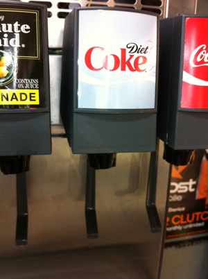
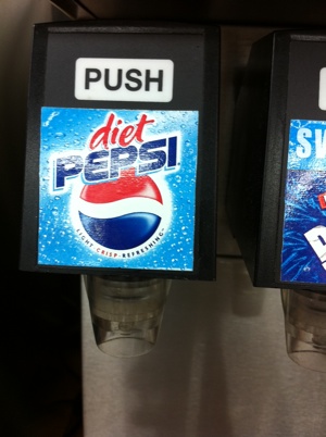
Quick: Which drink did I choose? If you were Sherlock Holmes, or even Encyclopedia Brown, you’d know: Diet Coke. Why? Because my left hand was occupied, so only my right hand was free, and the Diet Coke spout allowed easier one-handed operation. The Diet Pepsi dispenser required that I use one hand to hold the cup and the other to push the button, or that I set the cup down, hoping to position it accurately below the spigot, and then use the same hand to push the button — while hoping that the unanchored cup didn’t tumble. With Diet Coke, I just had to slam my cup into the wand below the spigot, which automatically positioned my cup precisely to catch every drop, and withdraw my cupped hand when I was done.
Software users are just this fickle as well, especially on the web where they haven’t invested any money in your product when they first try it. If it’s too hard to use, or even just seems too hard to use, they’ll move on. Marc Hedlund, Chief Product Officer at Wesabe, famously blogged about why Wesabe lost to Mint. Two sentences in that post stand out:
Between the worse data aggregation method and the much higher amount of work Wesabe made you do, it was far easier to have a good experience on Mint, and that good experience came far more quickly.
I was focused on trying to make the usability of editing data as easy and functional as it could be; Mint was focused on making it so you never had to do that at all.
So does ease of use matter? It evidently did to personal finance users, and it did to my thirsty self. My son, however, just drank from the water hose outside the store. Yum.
You are the lasiest cola buyer of all time. But you and Hedlund are correct about the overall importance of ease of use for luddites like me.
44 oz?!! I’d have to stop twice.